Button
Button is the message template for a card with action buttons.
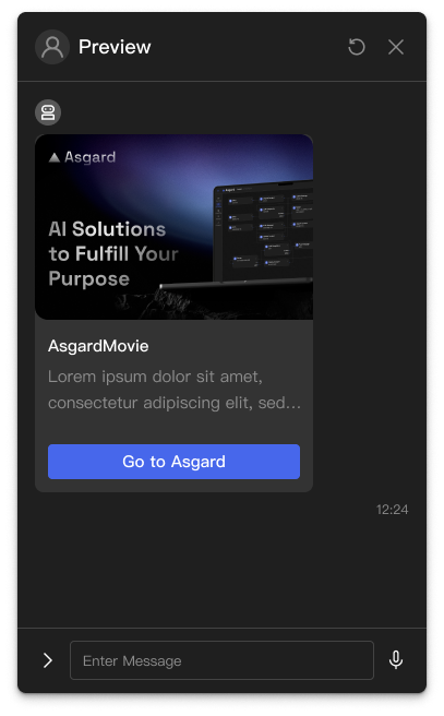
Basic usage
Button renders as a card in the chat interface, with a title, descriptive text and action buttons. Tapping a button triggers its action.
Template structure
JSON
{
  "type": "BUTTON",
  "thumbnailImageUrl": "https://example.com/bot/images/image.jpg",
  "imageAspectRatio": "rectangle",
  "imageSize": "cover",
  "imageBackgroundColor": "#FFFFFF",
  "title": "About the product",
  "text": "A well-made product with several capabilities.",
  "buttons": [
    {
      "label": "Buy now",
      "action": {
        "type": "uri",
        "uri": "https://shop.example.com/buy"
      }
    }
  ],
  "defaultAction": {
    "type": "uri",
    "uri": "https://shop.example.com/product"
  }
}
Properties
type (required)
The message template's type, always "BUTTON".
thumbnailImageUrl (optional)
The URL of the thumbnail shown at the top of the card.
imageAspectRatio (optional)
The image's aspect ratio:
"rectangle": 1.51:1"square": 1:1
imageSize (optional)
How the image is scaled:
"cover": fills the area, possibly cropping"contain": shows the whole image, possibly with blank margins
imageBackgroundColor (optional)
The image's background colour, as a hex code such as "#FFFFFF".
title (required)
The card's heading.
text (required)
The card's descriptive text.
buttons (required)
The array of action buttons. Each has a label and an action.
defaultAction (optional)
The action taken when the card's body — its title, text or image — is tapped. See the Action Object documentation.
quickReplies (optional)
An array of quick reply buttons. See Quick Replies.
Examples
To send a button card from Push Message:
- Choose
Expressionin the Template field's dropdown. - Enter the following JavaScript in the editor.
A plain button card
(() => {
  return {
    type: 'BUTTON',
    title: 'Support menu',
    text: 'Which service do you need?',
    buttons: [
      {
        label: 'Order status',
        action: {
          type: 'MESSAGE',
          text: 'I want to check my order',
        },
      },
      {
        label: 'Technical support',
        action: {
          type: 'MESSAGE',
          text: 'I need technical support',
        },
      },
    ],
  };
})()